Saturday 31 January 2015

Owl Always Love You

Evening everyone, do you like my cheesy post title? I just couldn't resist! With Valentine's day fast approaching I thought I had better start showing off some Valentine's day cards so that you can get making for your loved ones. 


Now do you get the title? He he (I think I'm funny but I'm not too sure how many people actually agree with me...) These were so simple and quick to make and yet so cute! The letters came from project life accessory packs which usually come with an alphabet of some kind in them but you could always use a stamp or die to achieve the same effect. I've listed below the two I've used but you can see what the alphabets looks like in each pack from the photos in the shop if you'd prefer a different set. You can't quite see in my first picture but the letters are actually red and shiny :-)

Supplies:


Wednesday 28 January 2015

It's Wednesday again

Morning everyone, well it's Wednesday again (that went quick didn't it!) which means it's time for another set of weekly deals. There is a real mix this week but my favourite item has to be the decorative dots embossing folder as I love this one and make quite a few cards with it.
 
Two things to remember, sale-a-bration is still running so make sure you snap up those exclusive free items while you can and my next monthly class is on next Monday (2nd Feb) and Tuesday (3rd Feb) so if you haven't already booked your space get in touch soon. Check out the classes tab at the top of the page for more information. We always have great fun :-)
 

Built for Free Using: My Stampin Blog


Monday 26 January 2015

Many colours of the Lotus

Evening all, I have been preparing all of the materials for my coffee and craft afternoon tomorrow. We are going to be using the Lotus Blossom stamp set which as you will have seen from one of my previous posts (Click here is you missed it) is a lovely 3 step stamp set which allows you to create gorgeous results in 3 easy steps. I have been having a play around with colour combinations and the order of stamping and I thought I would share my results with you. 

I have made the pictures large for this post so that hopefully you'll be able to see the colour combinations I have used. The first two photos have the same colour combinations but have been stamped in a different order. I found that to achieve the best results step 1 needed to be the first impression (ie straight from ink pad to paper), step 2 needed to be second impression (ie stamp it onto scrap paper first) and step 3 also needed to be second impression. The only exceptions to this are Pink Pirouette which is so light it needs to be first impression, Blackberry Bliss which can be a little dark even after stamping on scrap paper first and if you are only using one colour to create your flower make sure you stamp the step 3 onto scrap paper twice so that there is enough contrast between step two and three.

In this first picture I have followed the 1-2-3 order that is on the stamp set.


When looking for inspiration for lotus blossom cards several people have said to stamp them in reverse order (3-2-1) which is what I have done in this second picture.


I personally prefer the 1-2-3 images as I find it a lot easier to line them up if the darkest image is already on the paper plus I'm not sure if you can see from the photos but those done in reverse order don't have as much definition and detail. Some of the colour combinations don't show the detail at all well in this order. This is just my personal opinion so experiment and see what works best for you. 

This final picture is just a couple of extra colour combinations I played with after completing the charts. I saw a card on Stampin' Connection where the demo had used black ink, Pacific Point and Tempting Turquoise for a three colour flower, I really liked this colour combination and decided to give it a go with purples as well. I think it turned out well and have decided to show this one tomorrow afternoon.


Let me know what your favourite colour combination is, are there any you use that aren't on my sheets?

Supplies:


Built for Free Using:  My Stampin Blog

Sunday 25 January 2015

Boot Camp - Week 2

Well I have successfully reached the end of the second week of Boot Camp, I am a little behind on some of the videos I'm supposed to be watching but otherwise I'm on track! This weeks creative task involved us finding a technique through Stampin' Up! that we haven't used before and give it a go. There were several places we could look like the catalogues, Impressions (a Demo only magazine), the Stampin' Up! website or Stampin' Connection (a great place for us demos to chat and share ideas). I have seen and heard quite a bit about the Bokeh technique, originally a photographic technique, so when I found a video tutorial on Stampin' Connection I just had to give it a try.


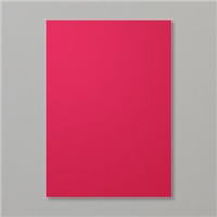
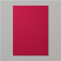
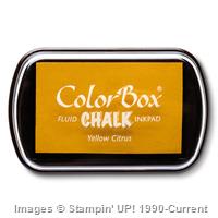
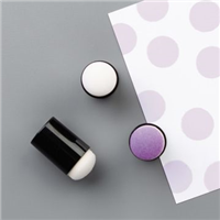
In the video the lady used White Craft ink but I don't have this (yet...!) so I decided to give it a go using the Yellow Citrus Chalk Ink and I think it has still turned out well. You start by randomly sponging the backgound with two different colours, mixing them a little in some places. Once this is dry you create a mask by cutting circles in various sizes out of either a window sheet or cardstock and then sponging the chalk ink (or craft ink) through the mask to create random circles. I then used the sponge dauber to add some smaller circles. You can add as few or as many circles as you like depending on how you want it to turn out. Practice and have fun!

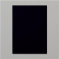
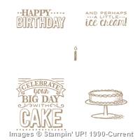
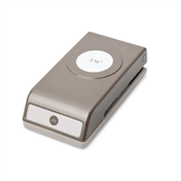
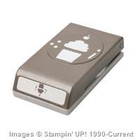
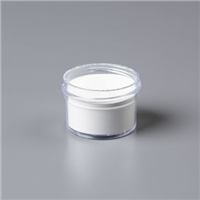
As my background was so colourful I decided to keep the sentiment and cake black and white so that they didn't get lost. For this I used the new blackboard card and white embossing powder. The embossing stands out so well on this black card, I love it! The sentiment itself is from the Sale-a-bration set Big Day which means you can get this set for free with any £45 spend. Feel free to contact me with any questions and orders or just click my shop link on the right hand side which takes you directly to my online shop.

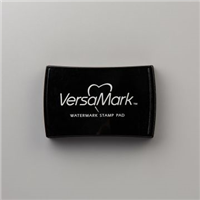
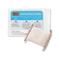
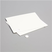
 One thing I need to point out here is you must must must use an embossing buddy when embossing onto this black card. Here is a photo to show you what happens if you don't.


It's not as clear, you get speckles all over it as the powder sticks anywhere it fancies on the card, awful! However you can see the results above if you take the time to give it a quick rub with the embossing buddy first. The powder then only sticks to the versa mark ink and you get a crisp clear print. In some circumstances this speckled effect could look quite good but here, no!

I hope you enjoy the rest of your Sunday and if anyone fancies joining me at my Coffee and Craft afternoon on Tuesday there are only 2 spaces left so drop me a message soon if you'd like to attend.
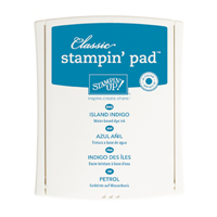
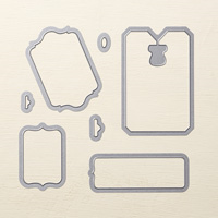
Supplies:


Price: £15.50
Built for Free Using:  My Stampin Blog