
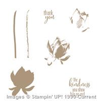
Evening all, I have been preparing all of the materials for my coffee and craft afternoon tomorrow. We are going to be using the Lotus Blossom stamp set which as you will have seen from one of my previous posts (Click here is you missed it) is a lovely 3 step stamp set which allows you to create gorgeous results in 3 easy steps. I have been having a play around with colour combinations and the order of stamping and I thought I would share my results with you.
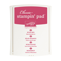
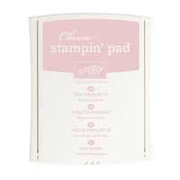
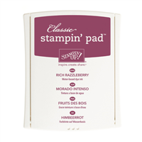
I have made the pictures large for this post so that hopefully you'll be able to see the colour combinations I have used. The first two photos have the same colour combinations but have been stamped in a different order. I found that to achieve the best results step 1 needed to be the first impression (ie straight from ink pad to paper), step 2 needed to be second impression (ie stamp it onto scrap paper first) and step 3 also needed to be second impression. The only exceptions to this are Pink Pirouette which is so light it needs to be first impression, Blackberry Bliss which can be a little dark even after stamping on scrap paper first and if you are only using one colour to create your flower make sure you stamp the step 3 onto scrap paper twice so that there is enough contrast between step two and three.
In this first picture I have followed the 1-2-3 order that is on the stamp set.

When looking for inspiration for lotus blossom cards several people have said to stamp them in reverse order (3-2-1) which is what I have done in this second picture.

I personally prefer the 1-2-3 images as I find it a lot easier to line them up if the darkest image is already on the paper plus I'm not sure if you can see from the photos but those done in reverse order don't have as much definition and detail. Some of the colour combinations don't show the detail at all well in this order. This is just my personal opinion so experiment and see what works best for you.
This final picture is just a couple of extra colour combinations I played with after completing the charts. I saw a card on Stampin' Connection where the demo had used black ink, Pacific Point and Tempting Turquoise for a three colour flower, I really liked this colour combination and decided to give it a go with purples as well. I think it turned out well and have decided to show this one tomorrow afternoon.

Let me know what your favourite colour combination is, are there any you use that aren't on my sheets?

No comments:
Post a Comment